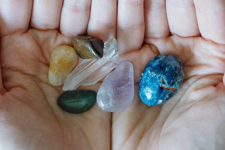

It’s possible to have two stones that are both green yet they will appear to have distinctly different colors. One may appear more yellow, lighter, and less intensely colored. The other may appear more blue, darker, and more intensely colored even in a small facet. If we simply refer to them both as “green,” we lose most of the information that an observer can capture.
Hue is the predominant color and the color direction of the secondary hue. A specimen might be described as green, yellowish green, or bluish green. The secondary hue is significant since it separates specimens that appear to be the same initially. It is important to examine the specimen under a neutral light source before settling on a hue description. Reflections from clothing, walls, and even a colored light bulb can alter the perception of hue.
Tone is the degree to which a color appears light or dark. For example, a pale pink specimen is light toned and a stone that appears almost black until light penetrates it is very dark. This observation can also be altered by the cut. Deep pavilions, unfavorable light position, and the presence of extinction can cause a transparent stone to appear much darker than its material color would suggest.
Saturation is the amount or intensity of the color. Strongly saturated blue appears bright and strong, while weakly saturated blue can appear gray or washed-out. Saturation is distinct from tone. A stone may appear light and strongly saturated or dark and dull and brownish. Keeping tone and saturation as two separate observations leads to better documentation of specimens.
To test this exercise, select a single cut specimen to examine under a neutral light source on a white observation tray. Examine the color face-up, then slowly rotate the specimen with tweezers. Record one sentence describing the hue, tone, and saturation. Repeat this process looking through the pavilion side. Note any differences between the crown and pavilion views as they can provide clues to color distribution, extinction, or color zoning.
The challenge is to avoid using a known gemstone name to describe the color, as this adds a level of interpretation to the observation. Writing sapphire blue or emerald green introduces an identification to the color observation. Rather, the observer should write, for example, medium-dark violetish blue with strong saturation, or light yellowish green with weak saturation. These descriptions stay useful even when you don’t know what kind of stone it is.
Compare your color description to the specimen again after turning away for a moment. Do you still perceive a secondary hue? Is the specimen actually dark or is there an issue with the light position? Is the color equally strong on all parts of the crown or does it diminish near the girdle? Asking these questions allows you to transform a simple color description into a gemological observation that can be repeated.